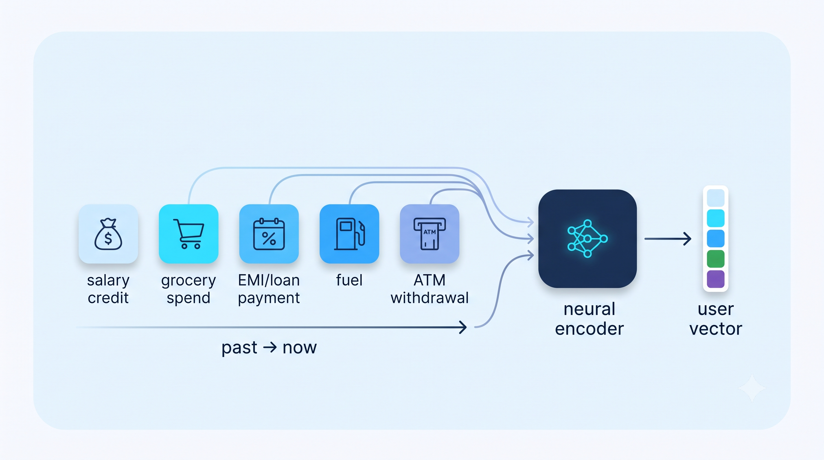
Branch is a financial services company, and in our lending business, we use machine learning models to predict the risk of customers applying for a loan. These credit models, as we call them, are built on top of features. Most of these features are hand-engineered, meaning we have a deterministic way of producing these features, using rules over data written in code. They are explicit, inspectable, and usually grounded in business intuition: count this event, measure that recency, bucket this frequency.
But some signals are a poor fit for hand-engineering. A good example is a user’s financial activity over time, better thought of not as a single number but as a time-ordered sequence of coarse, categorical events:
SALARY_CREDIT -> GROCERY_SPEND -> EMI_DEBIT -> FUEL_SPEND -> ATM_WITHDRAWAL -> UTILITY_BILL -> ...1
The order matters. The timing matters. The way events repeat, cluster, or stop appearing matters. Capturing that with rules (in code) means creating one code function or file after another: counts, shares, recency, burstiness, consistency, and rolling-window variants for many event categories. We brainstorm an idea, come up with heuristics, and then test them. The result is a wide, sparse feature surface that is expensive to maintain.
The question was not whether hand-engineered features were broken — they worked. It was narrower:
Can we replace a wide rule surface with a compact learned representation without losing performance?
This post walks through the experiment: we learn a compact vector from a user’s financial event sequence, add it to the existing credit model, and check whether the model recovers the same signal with far fewer event-stream features.
Why does this help?
The old feature surface had three problems.
First, it grew with the event taxonomy. Every new event category created pressure to add more count, recency, frequency, and windowed features. Less common categories often had to be filtered or grouped because the resulting columns were too sparse.
Second, each hand-engineered feature saw only the slice (e.g., specific event category) it was designed for. Cross-learning could still happen later in XGBoost, but only after the sequence had already been split into sparse per-category aggregates. Trees can combine columns, but they are a weak way to learn that two different event tokens play similar roles in a user’s sequence.
Third, the maintenance burden was high. A small number of event-stream features tended to matter most, but the model still needed a large surface area to give them a chance to appear.
The idea
Instead of describing each event category with separate rules, we try to learn the pattern in the whole sequence.
Each user has a sequence of event tokens. An event token identifies what happened at a point in time. The labels we use in this post (salary credit, loan repayment, cash withdrawal, utility payment) are coarse and illustrative, but the real token vocabulary is large and fine-grained. The existing event-stream representation used 700+ hand-engineered features. We train a small neural model to read those tokens in order and compress that surface into 64 learned dimensions, about a 12x reduction in feature count.
Those learned dimensions are not the final credit model. They are features.
At a high level:
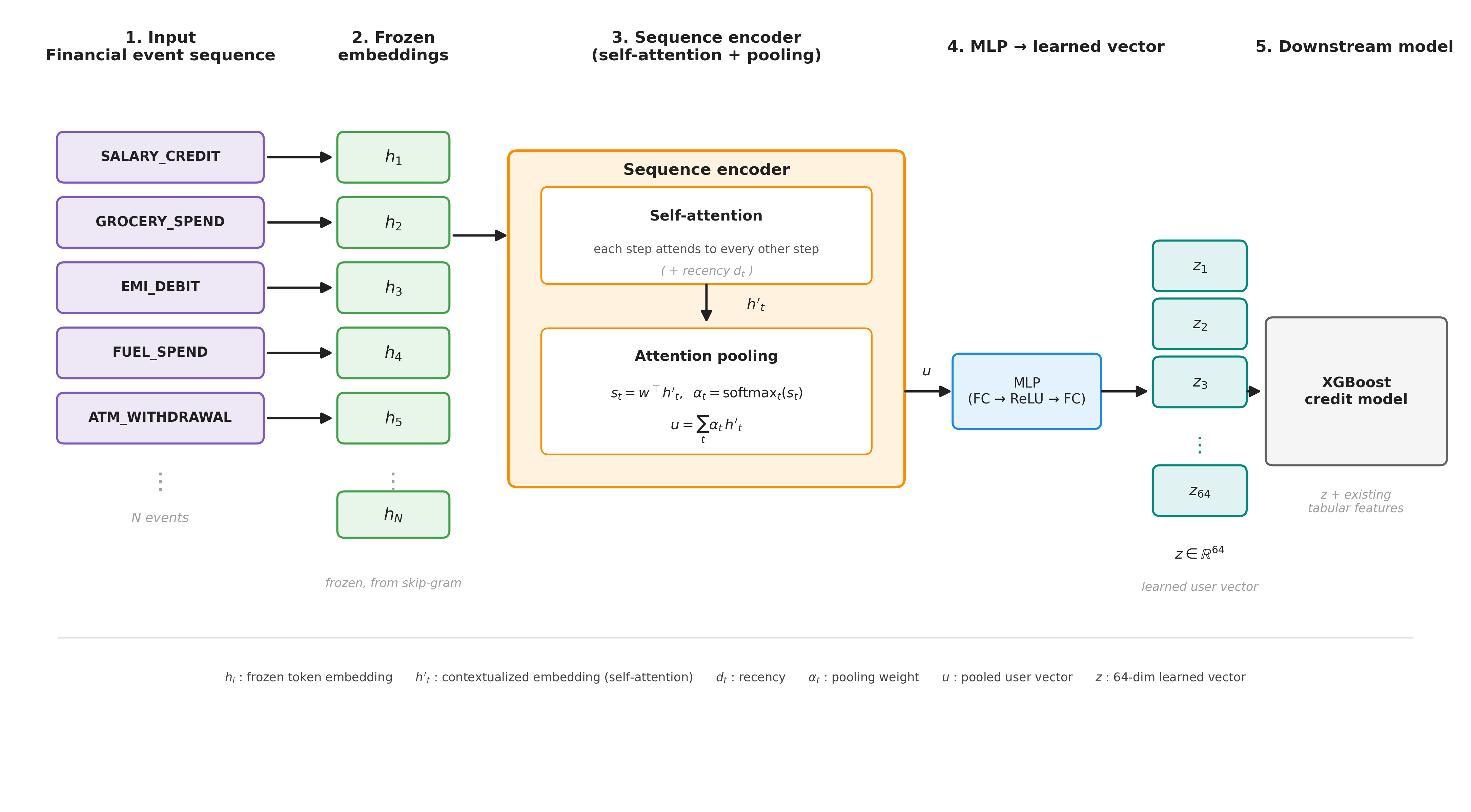
This setup lets each model do the job it is good at:
- The neural encoder turns a variable-length event sequence into a fixed-size representation;
- XGBoost uses that representation alongside the rest of the tabular features.
Model architecture
The pipeline has four steps:
- Learn an embedding for each event token.
- Pool a user’s event-token sequence into one user representation.
- Project that representation into 64 learned dimensions.
- Add those learned dimensions to XGBoost.
Step 1: Learning event-token embeddings
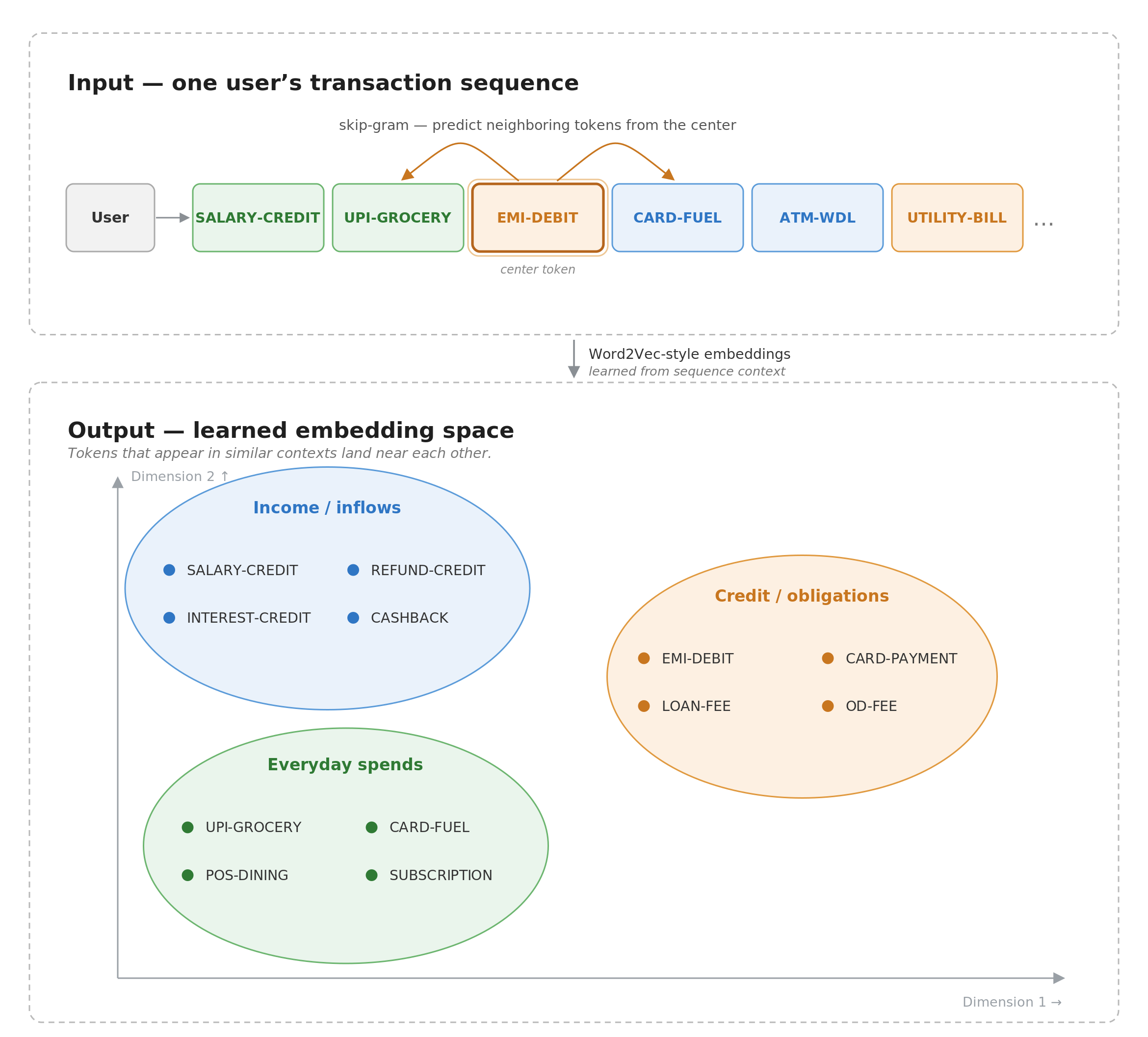
We start by learning an embedding for each event token using a skip-gram objective, following the same broad idea as Word2Vec (Mikolov et al., 2013).
For a user sequence like:
SALARY_CREDIT -> GROCERY_SPEND -> EMI_DEBIT -> FUEL_SPEND -> ATM_WITHDRAWAL -> UTILITY_BILL -> ...
The skip-gram model learns to predict nearby event tokens from a center event token. Event tokens that repeatedly appear in similar sequence neighborhoods across many users end up near each other in embedding space.
This is distributional similarity, not same-moment co-occurrence. For example, two event types may both tend to appear after salary credits or before repayment-related events, even if they do not happen together for the same user. The model learns the shared role in the sequence.
This stage also sees order, not elapsed time. A skip-gram window treats “salary credit then EMI debit” similarly whether the gap is thirty minutes or three days. We reintroduce coarse timing in the next stage, where the encoder folds a recency signal d_t into each event before pooling. Fine-grained inter-event gaps are not modeled in the embedding itself, which is a limitation of this setup.
Pretraining a separate skip-gram stage, rather than learning an embedding table end-to-end inside the supervised model, pays off precisely because the vocabulary is large and most tokens are individually sparse. Learning from co-occurrence across all user sequences lets related tokens share statistical strength and gives even rare tokens a sensible position in the space before the supervised model ever sees them. (For a handful of coarse categories, this step would be overkill, and you would just learn an embedding table directly.)
After this stage, the event-token embeddings are frozen. The next model uses them as fixed inputs rather than continuing to update them.
Step 2: Encoding a sequence into a user representation
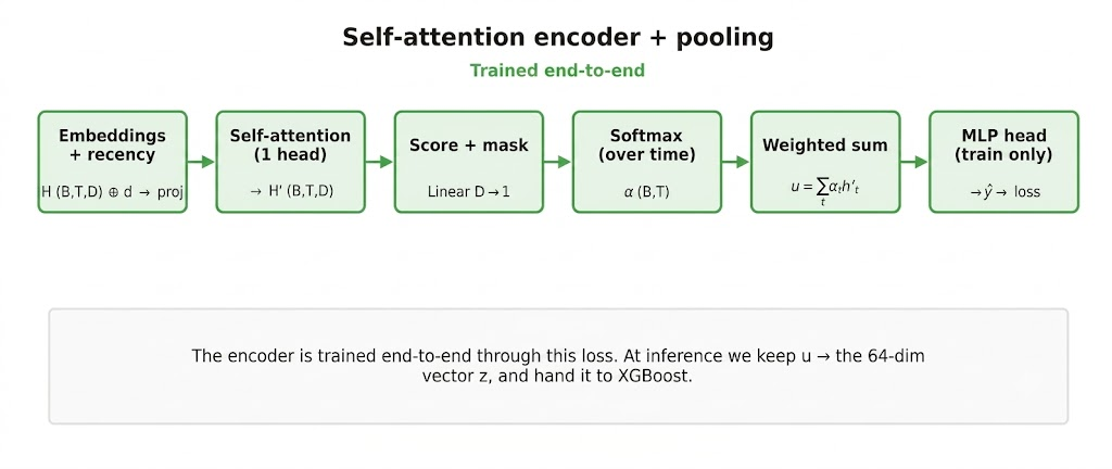
Once every event token has an embedding, a user is a time-ordered list of embedding vectors, one per timestep (one position in the sequence, corresponding to a single event token). The next problem is that different users have different sequence lengths, while XGBoost needs fixed-size features.
A simple average would be easy, but it would treat every event equally. That loses useful structure: recent events may matter more than old ones, repeated repayment events may matter more than one-off noise, and sparse signals can be diluted.
So we use a single-head self-attention encoder followed by attention pooling. Each timestep is first contextualized against every other timestep, so a token’s contribution can depend on what else is in the sequence and when (via the recency signal d_t), not on the token in isolation. We then score the contextualized timesteps, normalize across the sequence, and take a weighted sum:
Here, the subscript t indexes timesteps, so each quantity below is defined per event in the sequence. h_t is the frozen event-token embedding, d_t is the recency feature, h'_t is its contextualized representation after self-attention, alpha_t is the pooling weight, and u is the pooled user representation.
class SequenceEncoder(nn.Module):
    """Single-head self-attention contextualizes each timestep against every other
    timestep, so a token's score depends on the whole sequence, not just itself.
    The recency signal d_t is folded in as the order/position cue; padding is masked."""
    def __init__(self, emb_dim, time_dim=1):
        super().__init__()
        self.in_proj = nn.Linear(emb_dim + time_dim, emb_dim)
        self.attn = nn.MultiheadAttention(emb_dim, num_heads=1, batch_first=True)
        self.score = nn.Linear(emb_dim, 1)

    def forward(self, h, d, mask):
        # h: (B, T, emb_dim)  d: (B, T, time_dim)  mask: (B, T) True = real token
        x = self.in_proj(torch.cat([h, d], dim=-1))          # fold recency in
        ctx, _ = self.attn(x, x, x, key_padding_mask=~mask)  # each step attends to all steps
        s = self.score(ctx).squeeze(-1)                      # (B, T) cross-position scores
        s = s.masked_fill(~mask, float("-inf"))
        alpha = torch.softmax(s, dim=1)                      # (B, T)
        u = torch.bmm(alpha.unsqueeze(1), ctx).squeeze(1)    # (B, emb_dim)
        return u, alpha
Step 3: Extracting learned dimensions
The pooled representation then passes through a small MLP trained to predict credit default.
The prediction is only a training objective. For the downstream credit model, we keep the hidden representation and drop the neural prediction head.
class FeatureHead(nn.Module):
    def __init__(self, in_dim, hidden=64):
        super().__init__()
        self.fc1 = nn.Linear(in_dim, hidden)
        self.fc2 = nn.Linear(hidden, hidden)
        self.out = nn.Linear(hidden, 1)

    def forward(self, u):
        z = self.fc2(torch.relu(self.fc1(u)))
        logit = self.out(torch.relu(z))  # relu feeds only the training head
        return z, logit  # z is kept pre-relu as the feature vector
The vector z is the final 64-dimensional learned feature vector. Each coordinate is a learned dimension of the user sequence.
Step 4: Feeding XGBoost
At extraction time, we keep z, discard the neural model’s prediction, and add the learned dimensions to the existing tabular features.
z, _ = feature_head(u)
X = np.hstack([tabular_features, z.detach().cpu().numpy()])
dtrain = xgb.DMatrix(X, label=y)
In the offline experiment below, the learned dimensions were tested as a replacement for the hand-engineered event-stream features. The rest of the tabular model stayed in place; the swap was only in how we represented the event sequence.
Results
We evaluated the learned dimensions in two ways:
- an offline comparison between two XGBoost models trained on the same sample;
- a live A/B comparison across production and retrained models.
The offline setup compared:
- an XGBoost model with the existing hand-engineered event-stream features and no learned dimensions;
- an XGBoost model with the learned dimensions and no hand-engineered event-stream features.
The held-out test ROC-AUC was effectively unchanged:
- with hand-engineered event-stream features and no learned dimensions:
0.7398; - with learned dimensions and no hand-engineered event-stream features:
0.7400; - delta:
+0.0002.
That is not a meaningful accuracy lift; it is a tie. The point is what tied: 64 dense learned dimensions replaced 700+ hand-engineered event-stream features, about a 12x reduction in feature count, while holding held-out AUC essentially flat.
The learned dimensions did not just ride along as extra columns XGBoost could ignore. They stood in for the full hand-engineered event-stream surface. The result is parity at a fraction of the representation complexity.
Feature importance
The strongest evidence came from feature importance.
In the learned-dimension model, several dimensions ranked highly by total gain:
| Rank (total_gain) | Feature |
|---|---|
| 2 | Learned dimension (ntile) |
| 4 | Learned dimension (ntile) |
| 23 | Learned dimension (ntile) |
| 26 | Learned dimension (ntile) |
| 29 | Learned dimension (raw) |
| 40 | Learned dimension (ntile) |
This does not mean only those dimensions were created. The encoder produced 64 learned dimensions for every user. It means the tree model materially used a subset of them, and some of that subset landed near the top of the importance profile.
That is exactly what we hoped to see if the representation was compressing useful sequence signal. The model did not need the wide hand-engineered surface to recover comparable performance; a small subset of dense dimensions carried much of that signal.
In the other model, with hand-engineered event-stream features and no learned dimensions, none of the hand-engineered features were ranked this high by total gain. The highest-ranked hand-engineered feature was ranked 9th by total gain, but there were only 8 in the top 50.
Live A/B test
The live experiment compared three models:
- the existing production model;
- a freshly retrained model with the hand-engineered event-stream features and no learned dimensions (the baseline);
- the same retrained model with the learned dimensions swapped in for the hand-engineered event-stream features.
The live result matched the offline story. Delinquency and forecast LTV were effectively the same across the retrained variants, with no meaningful movement worth claiming.
Again, this was not an accuracy-lift result. It was a production sanity check that the learned representation did not create a measurable business-metric regression.
That distinction matters. If a compact representation can preserve the signal of a wide feature surface, the value is maintainability first: fewer event-stream columns to define, backfill, debug, review, and monitor. Interpretability also becomes a narrower problem. Instead of explaining hundreds of sparse rules, we can focus on the learned dimensions the downstream model actually uses.
Interpreting learned dimensions
A learned dimension sounds like a black box. A hand-engineered feature is easy to name: one might count missed repayment events in the last 14 days. A learned dimension has no such name; it is an entangled summary of event tokens, timing, and sequence context. If the credit model is going to lean on these dimensions, we need to convince ourselves they track real behavior rather than opaque noise that happens to correlate with default.
So we did not try to fully decode every dimension. We asked a narrower, practical question: when XGBoost relies on a learned dimension, does that dimension correspond to coherent user behavior? The short answer, which the rest of this section builds toward, is yes: the dimensions the model leaned on turned out to track real, stable behavior. Here is how we convinced ourselves, working through four layers of checks, each addressing a doubt the previous one left open:
- attention weights over the event sequence;
- n-tile heat maps over event categories and recency;
- attribution heat maps for the top learned dimensions;
- correlation checks against coarse behavioral metrics.
Attention weights
The pooling layer returns alpha, the weight assigned to each timestep. These weights show which parts of the sequence the encoder emphasized while building the user representation.
They are useful for inspection, but they are not enough on their own. A timestep can receive attention because it helps form the representation, while a more subtle interaction may still drive a specific learned dimension. For that, we need dimension-level diagnostics.
N-tile heat maps
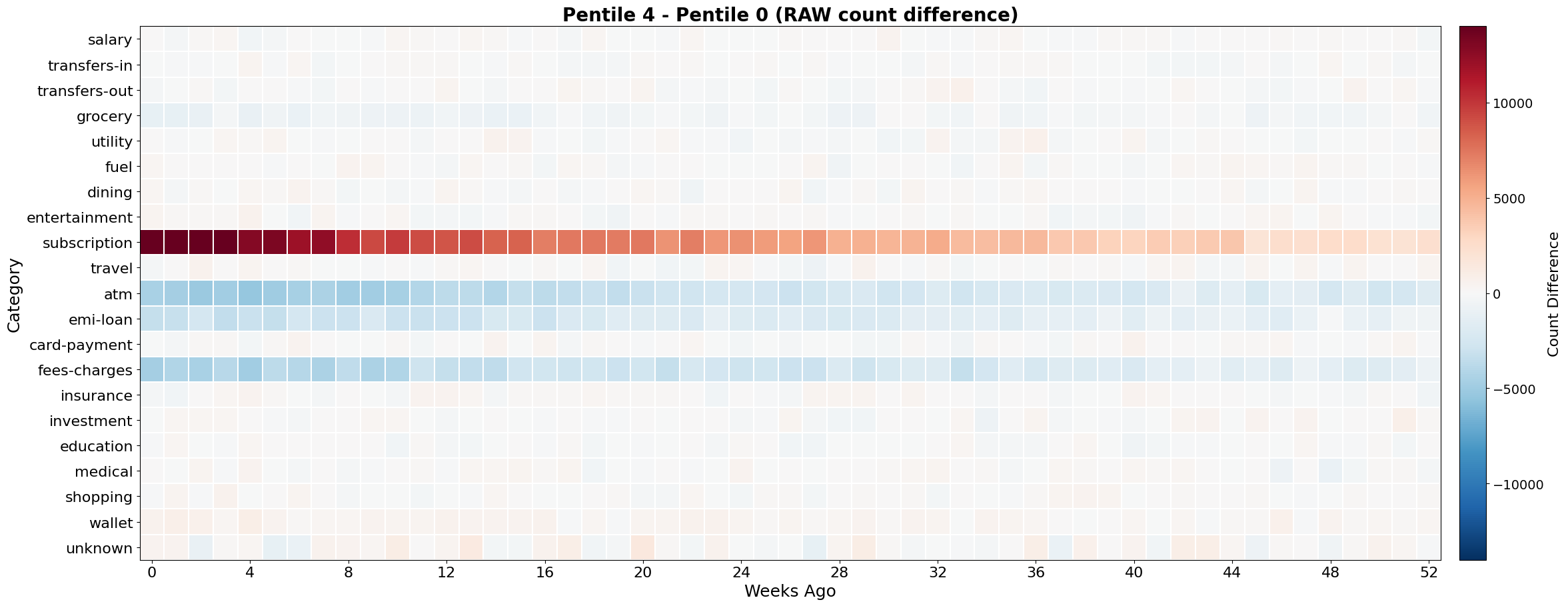
For a target learned dimension, we sort users by that dimension’s value and split them into five equal bins. Then, for each bin, we build an event-category by recency-week grid of event counts.
Comparing the top bin against the bottom bin shows how behavior differs between users with high and low activation on that dimension:
\[\Delta_{4,0}(c,w) = M_4(c,w) - M_0(c,w)\]Here, c is the event category and w is the recency week.
These heat maps helped convert abstract dimensions into behavioral checks. For example, one strong dimension showed a clear high-versus-low split across a small set of event categories, concentrated in the most recent weeks and fading with age. Most other categories were flat.
That pattern is useful because it is coherent. The dimension is not just random activation; it is tracking a stable difference in recent financial behavior.
Attribution heat maps
Raw event counts can be misleading. They answer the question: where are events common?
Attribution asks a different question: which event tokens pushed this learned dimension up or down?
For dimension-level attribution, we used Integrated Gradients (Sundararajan et al., 2017). The idea is to compare a user’s real sequence with a neutral baseline and accumulate how much each input contributes as we move from the baseline to the observed sequence.
That gives a directional view of contribution. Two event categories can have similar raw volume but very different attribution. A high-volume category may be mostly neutral, while a lower-volume category may strongly affect a learned dimension.
So we kept both views:
- raw heat maps for exposure and frequency;
- attribution heat maps for directional contribution.
When the two views disagreed, the disagreement was often informative. It showed cases where the model was not merely counting frequent events but using the event in context.
For example, dimension f41 showed both agreement and divergence between raw counts and attribution across event categories:
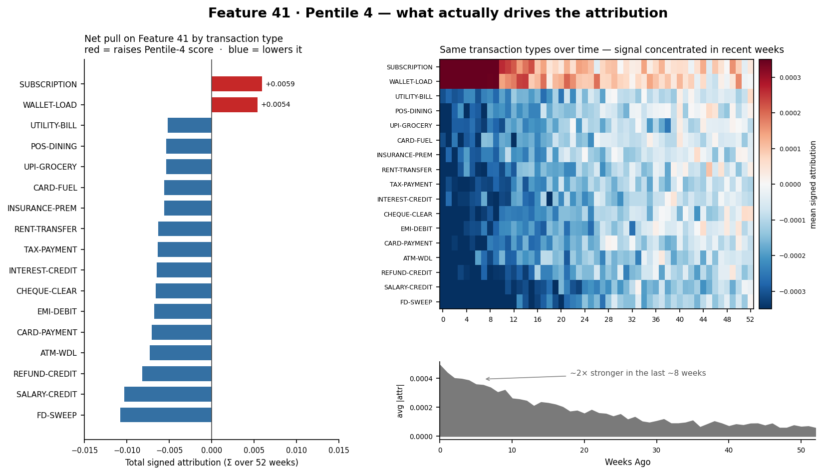
The goal was not to rename f41 as a single business concept. The goal was to verify that a top-ranked learned dimension was responding to coherent behavior rather than noise.
Correlation checks
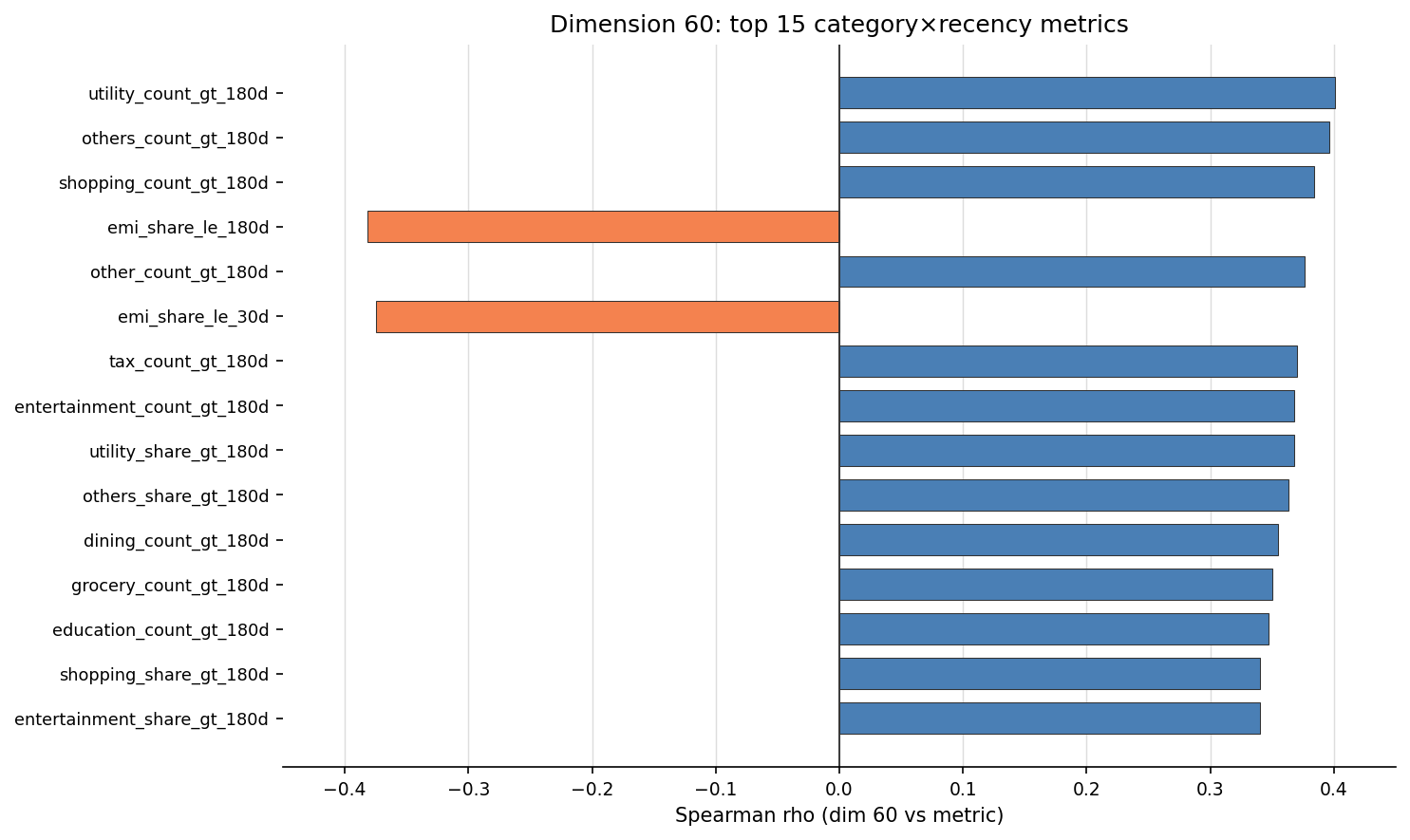
Attribution shows direction, but it reads that direction off the model’s own gradients, so on its own, it can be self-confirming. As an independent cross-check, we compared the top learned dimensions against coarse behavioral metrics computed outside the model: category-level aggregates, recency metrics, and other simple summaries.
These checks acted as guardrails against over-reading the heat maps. If a dimension visually looks tied to repayment behavior, the corresponding repayment aggregates should move in the same direction. If it looks recency-heavy, time-windowed metrics should reflect that.
For dimension f60, the correlation view helped confirm that the heat-map pattern was not just visual noise. It did not produce a perfect human label, but it showed that the dimension moved with plausible behavioral summaries.
That was enough for this experiment. We did not need every learned dimension to be fully interpretable; we needed the top dimensions to be behaviorally coherent and monitorable. That is what these checks delivered, which was all we needed: enough confidence to trust these dimensions in the credit model and to keep watching them in production.
Monitoring for drift
Learned dimensions reduce the feature surface, but they also concentrate the signal. That makes monitoring important.
If a learned dimension starts moving in production, we want to know whether the input behavior changed, not just whether the final model score shifted. So the monitoring view tracks changes in the event patterns feeding important learned dimensions.
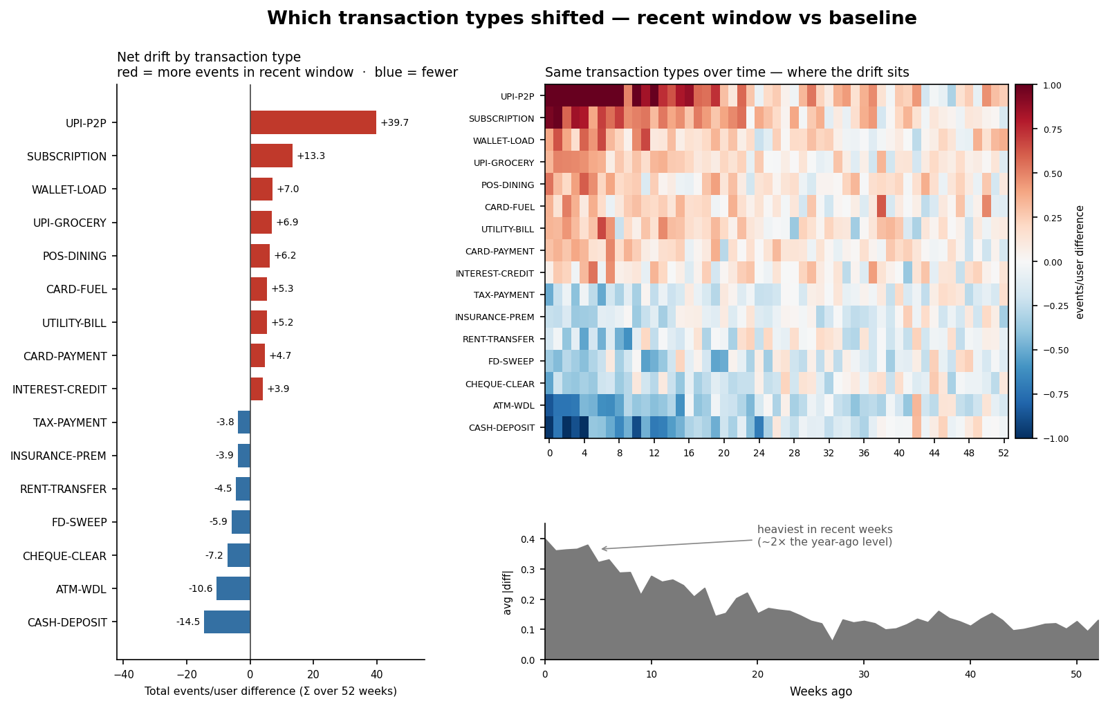
Each row is an event category. Red indicates that the category appeared more often in the recent window than in the baseline; blue indicates that it appeared less often. Sorting by the largest movers helps separate broad distribution drift from small background noise.
This monitoring is a practical companion to feature compression. If the model relies on fewer learned dimensions, we can spend more attention on the dimensions that matter most and the event categories that drive them.
Conclusion
The experiment started with a simple question:
Can a compact learned representation preserve the signal compared to a wide hand-engineered event-stream set of features?
Cautiously, yes. There was no meaningful drop: held-out AUC moved 0.7398 → 0.7400, and the live A/B showed no movement in delinquency or forecast LTV. The 64-dimensional learned vector matched a much wider hand-engineered surface, with two learned dimensions landing near the top of XGBoost’s importance by total gain.
The next step is to harden this in production: strip out more of the hand-engineered surface and keep the learned representation. The payoff isn’t just fewer columns; it’s a system that’s simpler to maintain, interpret, and monitor.
-
The tokens above are illustrative. This post deliberately abstracts away the data source and the feature internals; the focus is the modeling approach, not the underlying data. ↩
Disclaimer: All personally identifiable information (PII) used in the experiments described in this post was anonymised before analysis. No raw PII is included in the results, examples, or diagrams shared here.
Comments
Loading comments…